Some time ago, New Hope – The Travel Industry's Children's Fund got a new board. Now the foundation is taking the next step and launching a completely new website and updated visual identity. The changes are part of the organisation's ongoing work to strengthen its brand and increase engagement for children's rights worldwide. The new website has been designed with a focus on providing a clearer and more modern expression, as well as making the site more user-friendly. As a visitor, you should get a good overview of the foundation's projects, collaborations, and how companies or individuals can get involved in supporting the foundation's work.

New graphic profile
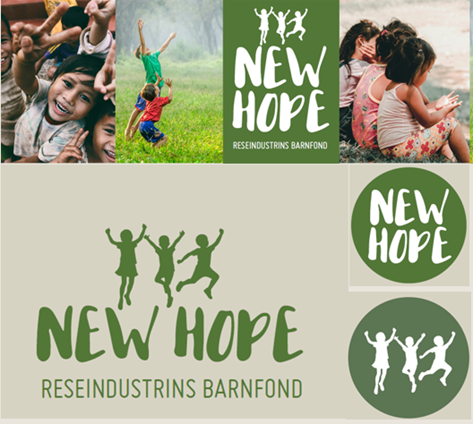
As the new website is launched, New Hope is also introducing an updated logo that clearly reflects the organisation's values and goals: to give children around the world hope and belief in the future, as well as a long-term commitment. The new design retains the same shape as the previous logo, but it has been given a deeper green tone and replaces the previous wings with a silhouette of jumping children, symbolising New Hope's important work of giving children hope and belief in the future.
The new design has been created by designer Pär Gamlin, who has worked for many years in the travel and tourism industry. Pär also created New Hope's original design.
– This update to the website and design marks a new beginning for New Hope. With an improved digital presence and a clearer identity, we hope to reach out to more companies and individuals to make an even greater difference together for children in vulnerable situations, says Kent Wallstedt, chairman of New Hope.
New Hope – the children's charity of the travel industry, works to improve the living conditions for children and young people worldwide, with a focus on education, safety and sustainable development.